
Splitwise
Splitwise
My role
product designer
Duration
3 days + UI polishing
Type
redesign concept of existing product
Project overview
Project overview
Splitwise is an app for sharing expenses with friends and organizing group bills for households and trips. However, the app is far from perfect. After over a decade since its release, it cries for a redesign.
For Splitwise I defined user experience gaps and fixed them by redesigning key features of the app. I also glow up user interface. All of this helped to met project goals - enhance user loyalty, rebuild their trust and give a sense of innovation. I didn’t stop there. I created ideas to convince users to upgrade to the Pro version, but also to attract new potential customers.
To do so, I reviewed the existing app, did desk research and competitor analysis, then defined pain points. I came up with three concepts, to finally choose one. Besides, I created a new visual design for the app. I took on this project during the UX Hackathon in December 2023. I worked individually with a mentor on a given topic for 3 days.
Intro
Intro
(Provided by the hackathon organiser)
(Provided by the hackathon organiser)
Initially developed as a MVP, Splitwise has rapidly gained a significant market share in the financial management application sector. Despite this success, the application now faces increasing competition from similar applications and even banking institutions offering comparable services. To maintain its position as an industry leader and demonstrate its innovative and reliable nature, a comprehensive UX redesign is essential.
Initially developed as a MVP, Splitwise has rapidly gained a significant market share in the financial management application sector. Despite this success, the application now faces increasing competition from similar applications and even banking institutions offering comparable services. To maintain its position as an industry leader and demonstrate its innovative and reliable nature, a comprehensive UX redesign is essential.
Rationale for Redesign
User Experience Gaps: Users have reported confusion in the current UX design, particularly in inputting an expense, setting right splits and understanding the functionality of the "Settle-up” button.
Market Competition: The rise of similar apps and services by banks demands a standout UI to differentiate Splitwise.
Innovation and Reliability: Reinforcing the company's image as an innovative and reliable leader in the finance management space.
Business Goals
Enhance User Loyalty: By improving the overall user experience, we aim to increase user retention and loyalty.
Sense of Innovation: Showcasing a modern, intuitive interface to reinforce Splitwise's image as an innovative leader.
Build Trust: A clear, user-friendly design will enhance the perception of reliability and trustworthiness in the app.
Research
Research
I started with desk research. I tried to understand the current situation of the app on the market. I looked for last app updates and checked the opinions on the App Store. I am a Splitiwse user myself, so I quickly jumped into the application. I took a lot of screenshots while going through the application. I also created a sitemap to better understand the structure.
I started with desk research. I tried to understand the current situation of the app on the market. I looked for last app updates and checked the opinions on the App Store. I am a Splitiwse user myself, so I quickly jumped into the application. I took a lot of screenshots while going through the application. I also created a sitemap to better understand the structure.
App analysis
App analysis
Next, I did the app analysis where I went deeper into the user journey. I placed screenshots on the whiteboard and combined them into user flows. I wrote down my observations and looked for pain points.
It may look messy, but it was very valuable for me to sort out my thoughts.
Next, I did the app analysis where I went deeper into the user journey. I placed screenshots on the whiteboard and combined them into user flows. I wrote down my observations and looked for pain points.
It may look messy, but it was very valuable for me to sort out my thoughts.

Insights from the app analysis:
there is no ‘Main screen’, there are ‘Friends’ and ‘Groups’ which shows mostly the same information - it can be confusing to users;
some screens look cluttered, there is a lot of informations on one screen and small texts
bad hierarchy of information
some colour typography texts don't meet WCAG standards
design is not accessible to people with disabilities
no difference in the display of charges for friends and groups - if you owe money to a person in group, you owe the person directly tool
the ability to customise the appearance of groups helps to distinguish them from each other
some CTA button are green and some are orange which can be confusing for users
well showed categories helps to track expenses
quite a lot of limitation in free version ex. limit to add max 3 expense per day
the Pro version currently offers: currency conversion, scanning of receipts, charts and graphs, expense search
advantages of the Pro version are not attractive enough for me to subscribe
Competitive analysis
Competitive analysis
The app has a lot of competitors on the market at the moment. I downloaded the most popular expense sharing apps and searched for their strengths, weaknesses and design.
The app has a lot of competitors on the market at the moment. I downloaded the most popular expense sharing apps and searched for their strengths, weaknesses and design.
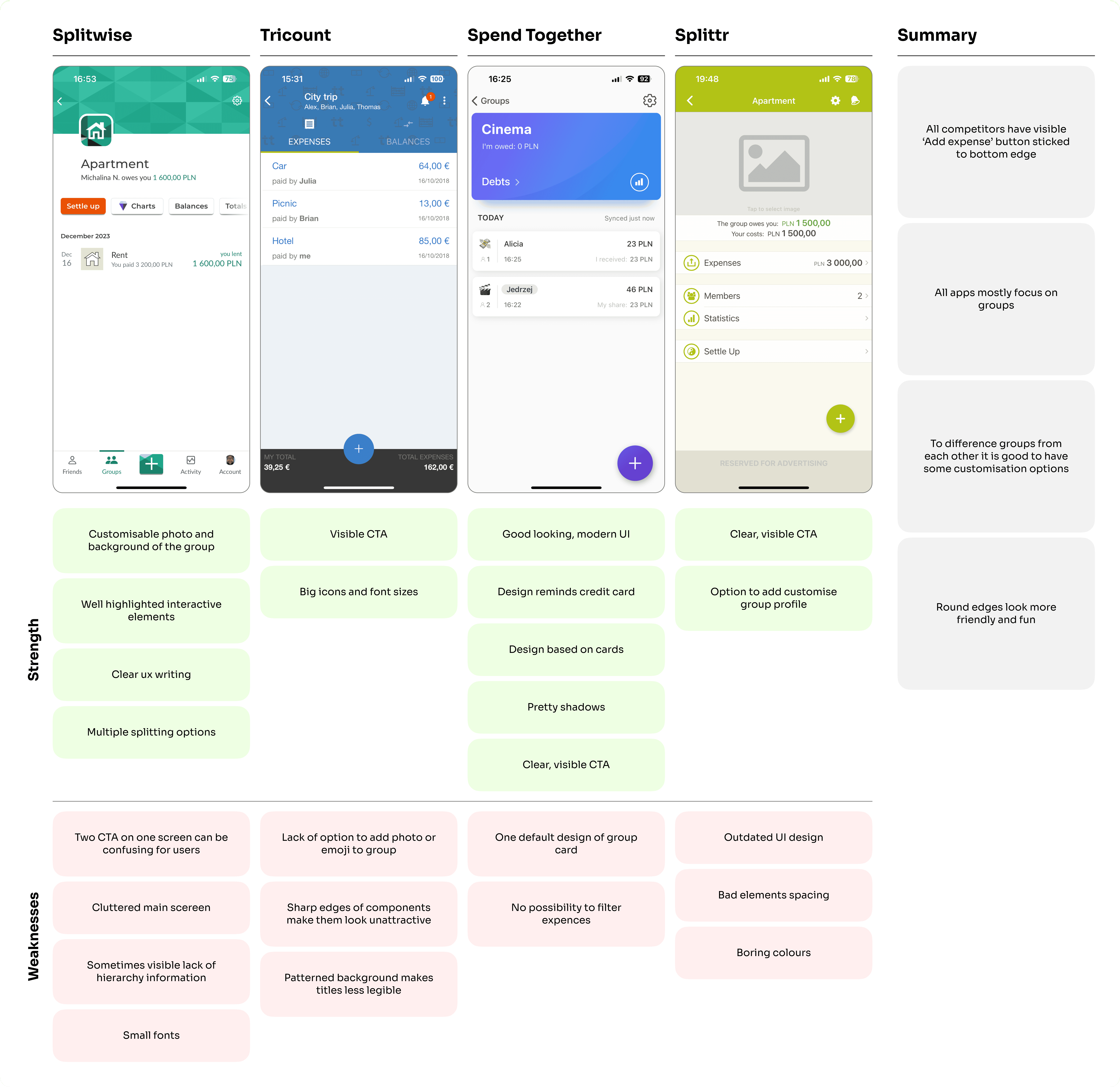
Insights form the competitors analysis:
none of the competitors require you to create an account to use them - Splitwise does
competitors are focused mostly on groups
Splitwise limits the addition of group expenses to 3 per day (for the free version) - the competitors have no limit
Splitiwse app is more personalised and has more advanced options than other apps in the ‘bill splitting apps’ segment
comparing with competitors only Splitiwse has the option of direct settlement with a friend who is a member in several groups
some competitors have the option to add ‘ghost friends’ and split the bills with them even if they don’t have the app
What have I learned from research
What have I learned from research
Key insights
Key insights
💡 Current UX solutions can be confusing for users, especially when it comes to distinguishing between 'groups' and 'friends', or during tasks such as adding or settling expenses. Simplifying and adding functionality in key areas can help improve the overall user experience.
💡 Current UX solutions can be confusing for users, especially when it comes to distinguishing between 'groups' and 'friends', or during tasks such as adding or settling expenses. Simplifying and adding functionality in key areas can help improve the overall user experience.
💡 The app has some UI issues with content hierarchy, colours, spacing and text. The last redesign of Splitwise was in 2019. Since then strong competitors with modern UI design have appeared on the market. Redesign is essential to maintain Splitwise's leading position on the market.
💡 The app has some UI issues with content hierarchy, colours, spacing and text. The last redesign of Splitwise was in 2019. Since then strong competitors with modern UI design have appeared on the market. Redesign is essential to maintain Splitwise's leading position on the market.
💡 Most of the app's revenue comes from people who buy the Pro version. People who use the app occasionally, e.g. only when travelling are not interested in subscribing to the Pro version as they won't use it every day.
So the questions that I asked at this point is: How might we convince users to use the app daily?
Defining key screens
Defining key screens
The next step was to define the key screens that needed to be redesigned. I collected all the pain points that I found during the research and I gathered some ideas and opportunities for improving the app.
The next step was to define the key screens that needed to be redesigned. I collected all the pain points that I found during the research and I gathered some ideas and opportunities for improving the app.

Concepts
Concepts
After brainstorming and some first sketches I had to decide how extensive the redesign will be. I had to keep in mind that the hackathon was only 3 days long. I prepared 3 concepts and asked my mentor for: opinion. The main difference between the concepts is the level of interference into the existing flow.
After brainstorming and some first sketches I had to decide how extensive the redesign will be. I had to keep in mind that the hackathon was only 3 days long. I prepared 3 concepts and asked my mentor for: opinion. The main difference between the concepts is the level of interference into the existing flow.

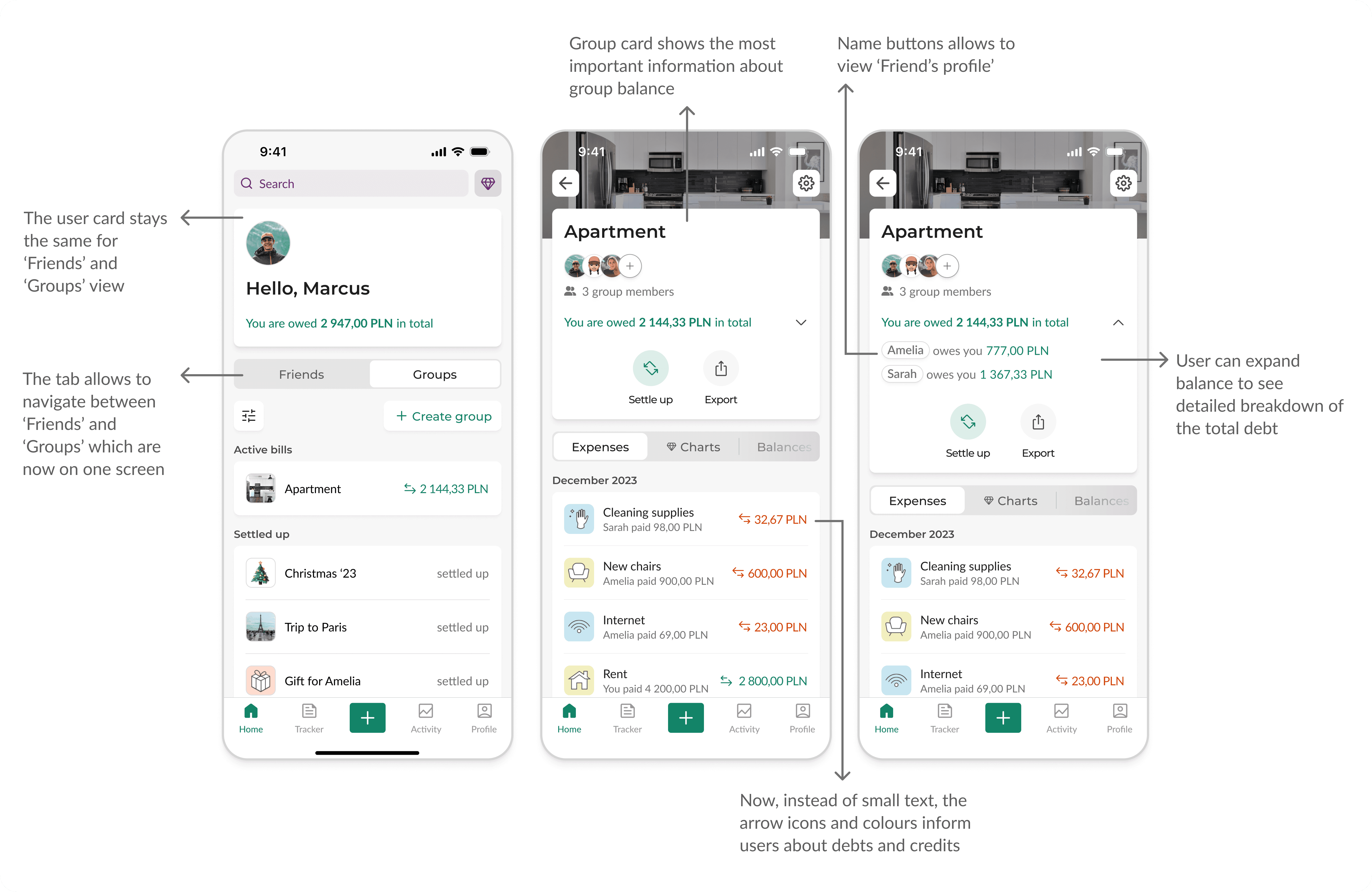
I decided to go with the Concept 1 - it assumes holistic redesign of Splitwise and integration in the flow.
Combine ‘Friends’ and ‘Groups’ into one screen
Create ‘Home’ page which shows the most important information of user spends
Leave the main CTA button ‘Add expense’ in the middle of tab bar
Reorganise tab bar by adding new functionality to the app, which would help the app to reach business goal
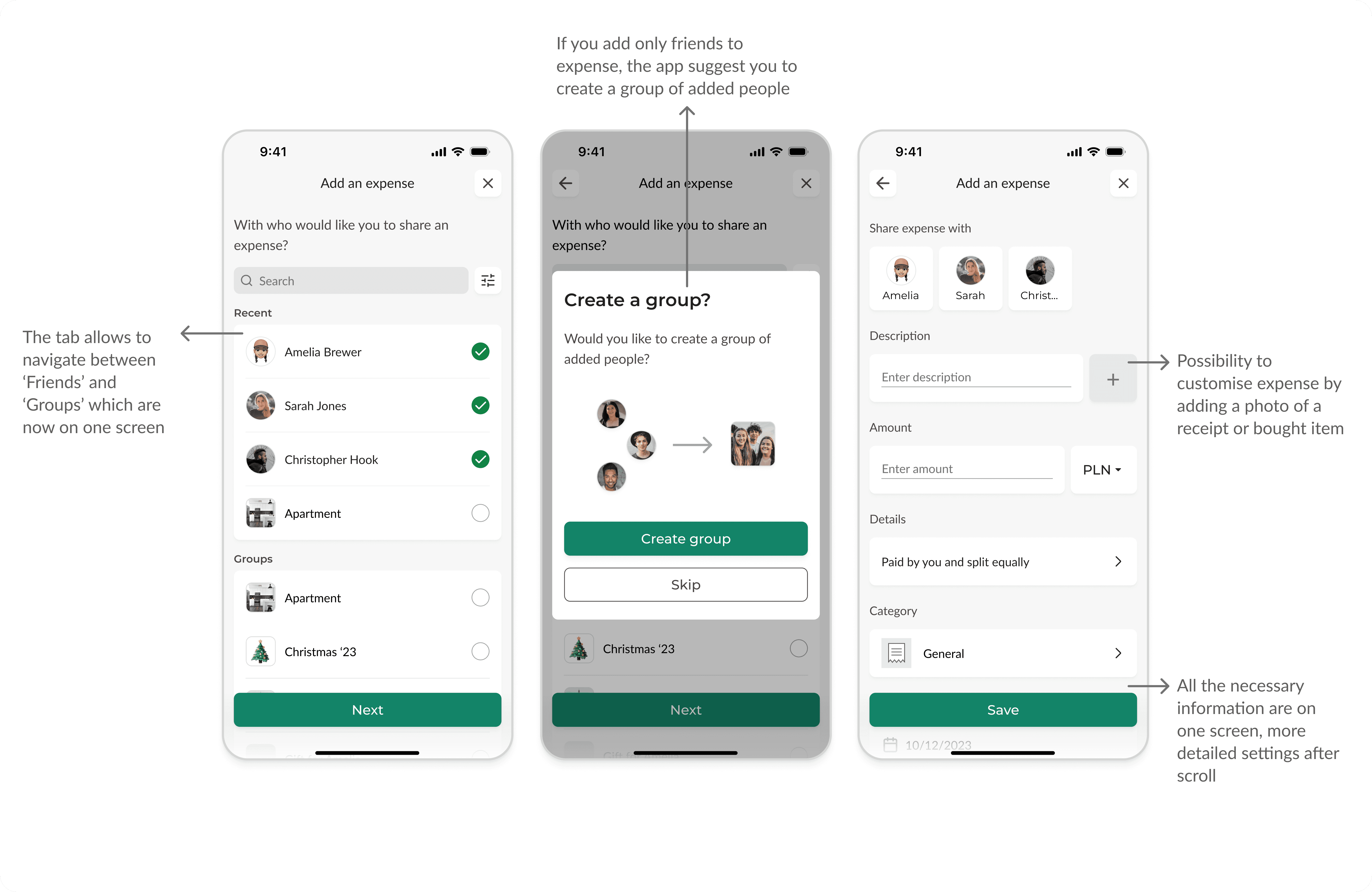
Unify the process of adding an expense to ‘Friends’ and to ‘Groups’ to work the same way
Add an option to create a group from added friends, while adding expense
Add an option to ‘Settle up’ with friends from ‘User profile’
Redesign ‘Settle up’ form to be more intuitive and clear
Add an option to transfer money in-app by BLIK/Apple Pay etc
Create concept of new functionality that could encourage users to purchase the PRO version
I decided to go with the Concept 1 - it assumes holistic redesign of Splitwise and integration in the flow.
Combine ‘Friends’ and ‘Groups’ into one screen
Create ‘Home’ page which shows the most important information of user spends
Leave the main CTA button ‘Add expense’ in the middle of tab bar
Reorganise tab bar by adding new functionality to the app, which would help the app to reach business goal
Unify the process of adding an expense to ‘Friends’ and to ‘Groups’ to work the same way
Add an option to create a group from added friends, while adding expense
Add an option to ‘Settle up’ with friends from ‘User profile’
Redesign ‘Settle up’ form to be more intuitive and clear
Add an option to transfer money in-app by BLIK/Apple Pay etc
Create concept of new functionality that could encourage users to purchase the PRO version
Wireframes
Wireframes
From ideas and sketches I jumped straight into wireframing.
From ideas and sketches I jumped straight into wireframing.

Results
Results


What would I do next?
What would I do next?
All design decisions I made during this hackathon, were based on my own research. This project could use a more empathetic approach. However, the redesign is a good opportunity to treat it as a hypothesis and validate it with real Splitwise users.
I would do in-depth interviews with real users and usability testing. Nobody likes redesigns, but my research shows that the app has some room for improvement. More research, idea validation and strategy to implement the changes would be my main focus in the next steps.
Thanks for reading this and see you in my next project!
More projects


hypothesis
desk research
competition analysis
wireframes
user interviews
impact/effort matrix
user flow
usability testing
prototype

competition analysis
moodboard
visual design
microinteractions
prototype
Let’s talk
Let’s talk
2024 Portfolio by Jędrzej Urbaniak