
moBiLET
moBiLET
My role
product designer
Duration
3 months
Type
redesign concept of existing product
INTRO
About the app
The moBiLET app allows to buy tickets for public transport (buses, trams, metro), long-distance transport (rail) and pay for parking in the paid zones. The service is active in over a hundred locations across Poland, including the biggest cities. MoBiLET is also service provider for banking applications.
The moBiLET app allows to buy tickets for public transport (buses, trams, metro), long-distance transport (rail) and pay for parking in the paid zones. The service is active in over a hundred locations across Poland, including the biggest cities. MoBiLET is also service provider for banking applications.
CONTEXT
Why I did this project
I have been using moBiLET for over a year. Most of the time I use it to pay for parking in paid zones. I have noticed that the app has some very annoying patterns. I started to think of moving to different app, since there are a few on the market. The more I use the app, the more I got annoyed by it. I mapped my journey which was the last straw that caused me to do this project.
I have been using moBiLET for over a year. Most of the time I use it to pay for parking in paid zones. I have noticed that the app has some very annoying patterns. I started to think of moving to different app, since there are a few on the market. The more I use the app, the more I got annoyed by it. I mapped my journey which was the last straw that caused me to do this project.
I asked myself, how can I redesign the app to improve the user experience of paid parking feature?

DESK RESEARCH
What users say
I already knew, that overall user experience with the parking feature isn't good. But I wanted to take a deep dive to see what users say about the app. I checked industry reports and looked for opinions on App Store as well as Google Play.
I already knew, that overall user experience with the parking feature isn't good. But I wanted to take a deep dive to see what users say about the app. I checked industry reports and looked for opinions on App Store as well as Google Play.

HYPOTHESIS
Defining unknowns
I collected all questions and assumptions I gained during desk research. I dug deeper, trying to break down each problem. Next, I grouped them by topic. Thanks to that, I noticed a lot of issues related to zone detection and user location confusion.
I collected all questions and assumptions I gained during desk research. I dug deeper, trying to break down each problem. Next, I grouped them by topic. Thanks to that, I noticed a lot of issues related to zone detection and user location confusion.
I noticed a lot of issues related to zone detection and user location confusion.

Key hypothesis
Many users complain about the outdated UI and missing features. While keeping this in mind, I decided to focus on more specific problems.
Many users complain about the outdated UI and missing features. While keeping this in mind, I decided to focus on more specific problems.
Users feel lost because they don't know which zone to pay for.
Users feel lost because they don't know which zone to pay for.
People get frustrated when they lose money because of a wrong zone choice.
People get frustrated when they lose money because of a wrong zone choice.
Users prefer GPS to choose the right paid zone for them.
Users prefer GPS to choose the right paid zone for them.
COMPETITION ANALYSIS
What can I learn from competitors
I picked 3 of the most popular apps which allows user to pay for parking - SkyCash, mPay and AnyPark. I also checked the bank applications that have the parking feature.
I picked 3 of the most popular apps which allows user to pay for parking - SkyCash, mPay and AnyPark. I also checked the bank applications that have the parking feature.
I analysed how my competitors are helping users to find the right paid zone, but also their UI and purchasing process. I divided the analysis into four categories: strengths, weaknesses, design and opportunities.
I analysed how my competitors are helping users to find the right paid zone, but also their UI and purchasing process. I divided the analysis into four categories: strengths, weaknesses, design and opportunities.
I found that apps like mPay or AnyPark are easier to use because they show user position on the map.
Next I did a comparison of functionalities among competitors and compare them with moBiLET. This helped me to understand what functionalities moBiLET are missing. TL;TR, if you want to dive in here is a link.
Next I did a comparison of functionalities among competitors and compare them with moBiLET. This helped me to understand what functionalities moBiLET are missing. TL;TR, if you want to dive in here is a link.
Direct competitors
Direct competitors
Indirect competitors
Indirect competitors

USER INTERVIEWS
How I validate my hypothesis
I asked users. I conducted 5 user interviews to have a deeper understanding of the problem and to validate if my hypothesis are correct.
I asked users. I conducted 5 user interviews to have a deeper understanding of the problem and to validate if my hypothesis are correct.
What I have learned from user interviews
All participants experienced frustration at least once because they didn't know what zone they were in
All participants experienced frustration at least once because they didn't know what zone they were in
All participants experienced frustration at least once because they didn't know what zone they were in
Users want to be informed about the duration of the zone and the expected costs of parking
Users want to be informed about the duration of the zone and the expected costs of parking
The location search function does not significantly affect the usability of an app, the key is how this information is presented to the user
The location search function does not significantly affect the usability of an app, the key is how this information is presented to the user
The problem is less common in smaller cities when there is usually one paid zone
When users are not sure which zone to pay for, they search on the web or check the parking meter
Because of many app issues, users don't trust the app when it suggests the zone
All participants mentioned that the app is ugly or non–intuitive
PROBLEM STATEMENT
Turning insights into statement
At this point I summarised everything I had learned. I went back to my hypothesis and validated them with the insights I gained. Next I formulated the problem statement.
At this point I summarised everything I had learned. I went back to my hypothesis and validated them with the insights I gained. Next I formulated the problem statement.
People feel lost and frustrated when parking in paid zones because the app doesn't give them enough information about their location, the zone duration and the expected cost of parking.
How might we…
show in a clear way in which zone the user is?
make the users feel confident about their zone choice?
help users find the correct paid parking zone if they don't allow to track their location?
show in a clear way in which zone the user is?
make the users feel confident about their zone choice?
help users find the correct paid parking zone if they don't allow to track their location?
IMPACT/EFFORT MATRIX
Defining the most valuable ideas
I did a brainstorming of possible solutions and listed all the actions and new features that would best answer the previously formulated questions. Next, I created an 'Impact/Effort Matrix' to help me decide which ideas to focus on in terms of their impact and effort for the project.
I did a brainstorming of possible solutions and listed all the actions and new features that would best answer the previously formulated questions. Next, I created an 'Impact/Effort Matrix' to help me decide which ideas to focus on in terms of their impact and effort for the project.
I tried to look at the ideas from a business perspective. But since I didn't have much information about the business goals, I assumed that:
I tried to look at the ideas from a business perspective. But since I didn't have much information about the business goals, I assumed that:
effort - number of elements to redesign
impact - improvement of the usability.
effort - number of elements to redesign
impact - improvement of the usability.
MAIN FOCUS
So, where should I focus?
I decided that displaying detailed zone information before the purchase process would have the greatest impact on users.
From in-depth interviews, I learned that the way the app presents information to the user is key. I believe that by showing users their location and giving them detailed information about the zone, they will be more confident in their choice.
Doing this before the purchase process will prevent frustration. This idea requires a redesign of the user flow, but also how the app informs about the user's location. It can be a point of differentiation among competitors.
I decided that with a low effort I can:
Show user's position on the map - this solution works well for some of my competitors. It will help people find the right paid zone
Create a shortcut to the most recently purchased tickets - I learned that people often park in the same locations. This shortcut will reduce the number of steps in the purchase process, making it faster and more intuitive
Additionally, I will also focus on improving the UI and add the most requested feature by users - highway tickets.
Additionally, I will also focus on improving the UI and add the most requested feature by users - highway tickets.
USER FLOWS
Improving user flow
I focused on the most common user flow – paying for a parking ticket. I analysed the current app flow and improved it as is shown below. From industry reports and IDIs, I learned that the start-stop parking method is the most common. The new flow favours the shortest path and gives the user more control when changing settings.
I focused on the most common user flow – paying for a parking ticket. I analysed the current app flow and improved it as is shown below. From industry reports and IDIs, I learned that the start-stop parking method is the most common. The new flow favours the shortest path and gives the user more control when changing settings.
SKETCHES
Let's design
I started with what I feel good at - sketching. I quickly put my ideas on paper and selected a few, that I wanted to work with. Next, I turned them into wireframes and prepared for user testing.
I started with what I feel good at - sketching. I quickly put my ideas on paper and selected a few, that I wanted to work with. Next, I turned them into wireframes and prepared for user testing.

USABILITY TESTS
Testing, testing, testing…
I carried out usability tests with 3 participants. Each test involved going through 3 pre-prepared scenarios. The tests were done at an early stage so I didn't waste time on design that wouldn't work.
I carried out usability tests with 3 participants. Each test involved going through 3 pre-prepared scenarios. The tests were done at an early stage so I didn't waste time on design that wouldn't work.
Test 1 - A few hiccups
Observations
People found it easy to get to the parking settings (screen 4)
All participants said that they felt confident with the way the app informed them about zone selection
Participants usually stopped at the parking settings (screen 4), saying it was too much information to process
The testers didn't understand the purpose of the timer on screen 4

Test 2 - A bit better
Changes
I removed the timer and simplified the parking settings screen by using a 'toggle button'
I prioritised the 'unlimited' parking method
I removed the timer and simplified the parking settings screen by using a 'toggle button'
I prioritised the 'unlimited' parking method
Observations
Testers liked the clean design
People don't like having to read instructions
Participants mentioned that they don't understand the terms 'unlimited' and 'limited'
People expected to see the min. and max. parking fee before choosing parking method
Testers liked the clean design
People don't like having to read instructions
Participants mentioned that they don't understand the terms 'unlimited' and 'limited'
People expected to see the min. and max. parking fee before choosing parking method
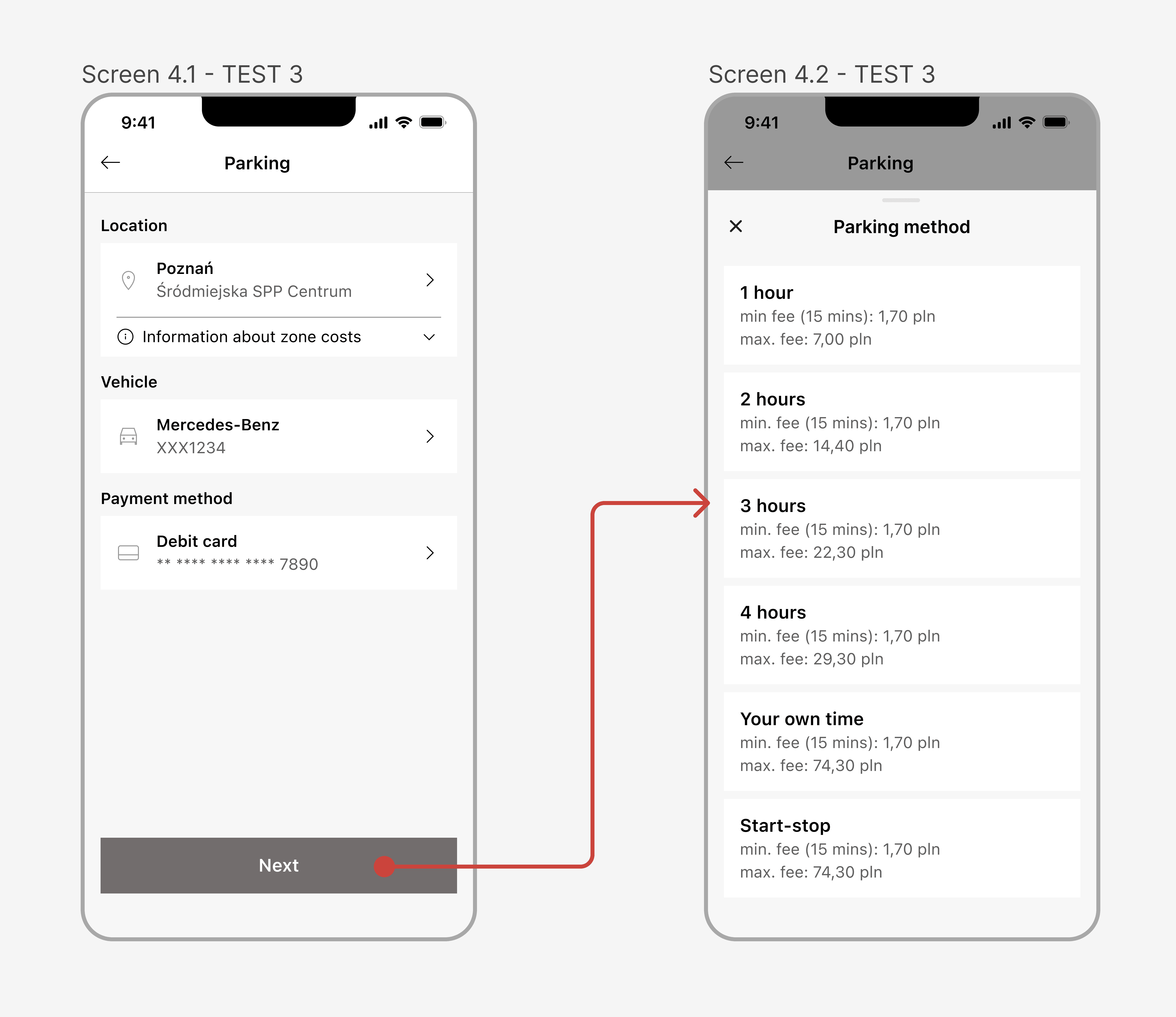
Test 3 - Everything went well
Changes
I added an extra screen to show all parking methods
I used a pattern of displaying possible parking options familiar to my competitors
I added an information about the min. and max. possible charge of each option
I added an extra screen to show all parking methods
I used a pattern of displaying possible parking options familiar to my competitors
I added an information about the min. and max. possible charge of each option
Observations
The participants didn't seem to have any problems in completing the tasks
Jakob's law works pretty well here and confirming that people prefer the solutions that they are used to
The participants didn't seem to have any problems in completing the tasks
Jakob's law works pretty well here and confirming that people prefer the solutions that they are used to
What I have learned from user testing
The design process is never linear - it took me 3 rounds to get a satisfying result
I was too focused on fewer clicks and screens - when I stopped thinking in terms of numbers, I actually improved usability
Don't underestimate Jakob's law - users prefer the solutions that they are used to
The design process is never linear - it took me 3 rounds to get a satisfying result
I was too focused on fewer clicks and screens - when I stopped thinking in terms of numbers, I actually improved usability
Don't underestimate Jakob's law - users prefer the solutions that they are used to

STYLE GUIDE
How I shaped my designs
The UI of the current application has sharp corners and uses two main colours. Primary - dark red and secondary - blue. In my design, I wanted to give the app a modern and playful look. I did this by using rounded corners and a fresh, pastel colour palette. I kept the primary colour as some users may associate the brand with the dark red, but changed the saturation to make it more accessible.
The UI of the current application has sharp corners and uses two main colours. Primary - dark red and secondary - blue. In my design, I wanted to give the app a modern and playful look. I did this by using rounded corners and a fresh, pastel colour palette. I kept the primary colour as some users may associate the brand with the dark red, but changed the saturation to make it more accessible.
During the design process I made more than 36 screens. I use an atomic design approach, creating components from smaller elements and building screens from them. I also take care of the file structure and try to keep it tidy by naming screens and grouping them by flows.
During the design process I made more than 36 screens. I use an atomic design approach, creating components from smaller elements and building screens from them. I also take care of the file structure and try to keep it tidy by naming screens and grouping them by flows.

RESULTS
Main user flow (happy path)
The improved parking function focuses on reassuring the user about their location, parking cost and duration by:
The improved parking function focuses on reassuring the user about their location, parking cost and duration by:
Map-based interface - helps users understand where they are and makes it easier to navigate between paid parking zones
Presenting users with key information before the purchase process - giving them peace of mind about expected costs and preventing frustration
Gathering all the necessary information on one screen - this solution gives users better control over parking settings and makes them easier to change.
Informing user about the correct parking zone
Case 1
User wants to pay for a car in a different parking zone (insight from user interviews) - user can manually select different parking zone from the map
User wants to pay for a car in a different parking zone (insight from user interviews) - user can manually select different parking zone from the map

Case 2
User enters the app when the zone is inactive (e.g. user enters on Sunday)
User enters the app when the zone is inactive (e.g. user enters on Sunday)

Case 3
User enters the app when is outside the parking zone
User enters the app when is outside the parking zone

More projects


desk research
app analysis
competition analysis
wireframes

competition analysis
moodboard
visual design
microinteractions
prototype
Let’s talk
Let’s talk
2024 Portfolio by Jędrzej Urbaniak