Beauty Lab
Beauty Lab
My role
UI designer
Duration
7 weeks
Type
concept of a new product
Project overview
Project overview
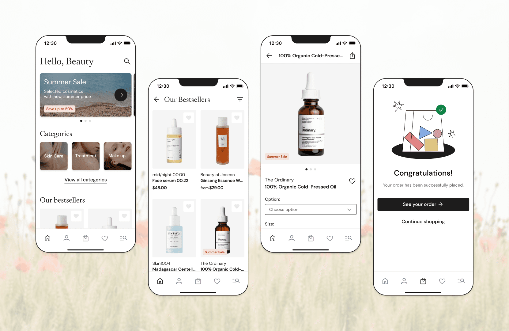
Beauty Lab is a project for a mobile e-commerce app that was created for an imaginary natural cosmetics company. My main focus was the shopping flow.
In this project I am going through all visual design phases, from defining the brand identity, to high-fidelity wireframes. I also thought of and designed micro-interactions. Finally, I put it all together in a prototype showing the complete shopping flow. This project was created during the Dare IT UI challenge.
Intro
Intro
About the brand
About the brand
At the very beginning I made assumptions about the brand and its customers. I have listed the most important parts below:
At the very beginning I made assumptions about the brand and its customers. I have listed the most important parts below:
Beauty Lab is an e-commerce shop that sells natural cosmetics
The sold cosmetics come in many different variations (capacity, colour, fragrance, etc.)
The target audience is premium customers
The design must include all the necessary screens, to allow the customer to buy their favourite cosmetics - from the home page to the success page
The design must allow to purchase products as a guest
Research
Research
Competitive analysis
Competitive analysis
First, I checked the competition on the market, how they show their products, and what make them stand out.
Applications that I considered as a direct competitors:
Zalando
Notino
Sephora
First, I checked the competition on the market, how they show their products, and what make them stand out.
Applications that I considered as a direct competitors:
Zalando
Notino
Sephora
First, I checked the competition on the market, how they show their products, and what make them stand out.
Applications that I considered as a direct competitors:
Zalando
Notino
Sephora
Flow analysis
Flow analysis
I got to know my direct competitors better. I analysed, not only their shopping flow, but also how they present sales or new products.
I took some inspirations from indirect competitors like Nike, Zara, H&M and IKEA. I pointed out the parts of designs I liked. Later, I made a checklist of the necessary elements on each screen. After that, I was finally ready to start to make the wireframes.

Searching for brand identity
Searching for brand identity
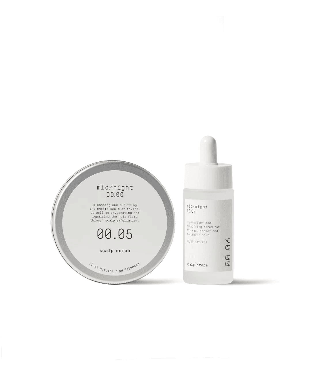
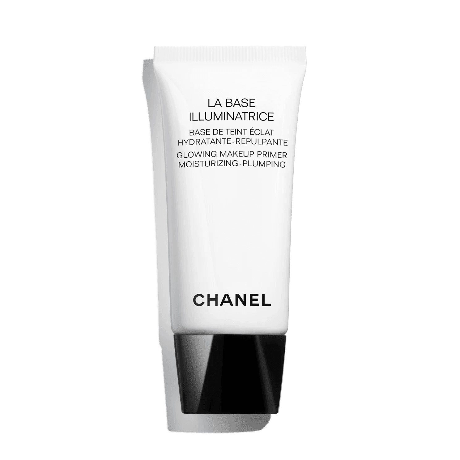
Next, I did some research on trends in cosmetics brands. I discovered that the most luxurious ones, such as The Ordinary, Beauty of Joseon, midnight 00.00 or Chanel, use simple, minimalist packaging, with muted, often contrasting colours and non-serif typography.
Next, I did some research on trends in cosmetics brands. I discovered that the most luxurious ones, such as The Ordinary, Beauty of Joseon, midnight 00.00 or Chanel, use simple, minimalist packaging, with muted, often contrasting colours and non-serif typography.


Moodboard
Moodboard
I searched for inspiration that would fit into the brand identity of a natural cosmetics company. I wanted to find the right visuals for words like: natural cosmetics, beauty routine, self-care, etc.
I searched for inspiration that would fit into the brand identity of a natural cosmetics company. I wanted to find the right visuals for words like: natural cosmetics, beauty routine, self-care, etc.

Visual design
Visual design
During the design process, I followed my previous design decisions. I used images from Unsplash and made sure that all visuals were in line with the brand's art direction.
During the design process, I followed my previous design decisions. I used images from Unsplash and made sure that all visuals were in line with the brand's art direction.

Typography
Typography
For headers I decided to use the Newsreader font and combine it with the DM Sans for smaller headers and body text. This helped me to create visual hierarchy of information.
For better readability, the headlines have a smaller letter-spacing value. While the Newsreader font adds lightness and elegance to the app, the DM Sans is a universal font that looks professional and is easy to read at smaller sizes.
Icons
Icons
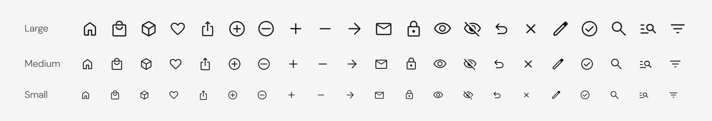
I used icons from the Material Symbols and Icons library. I chose icons with rounded edges to better match the brand. For the project I created a small icon library with 3 sizes. Large - 32x32 px, medium 24x24 px and small (18x18 px).
I used icons from the Material Symbols and Icons library. I chose icons with rounded edges to better match the brand. For the project I created a small icon library with 3 sizes. Large - 32x32 px, medium 24x24 px and small (18x18 px).
Colours
Colours
To give the app a minimalistic and elegant look, I used a monochromatic palette, complemented with colours for illustrations.
Primary colours are black and white, which gives the app a simple, elegant look
Contrasting colour palette is good for readability and meets the WCAG standards
To complement the palette with colours I went with washed yellow, red, blue and pink, which I created by changing the hue value, while saturation and brightness values stayed the same
For validation, I used colors which are generally recognisable as positive, warning and negative

Components
Components
In creating this app, I used an atomic design methodology. I created components from smaller elements like typography, colours, shapes, images, etc. This helped me to speed up my work a lot. I could copy components between screens, or make changes to one - the master component - and apply it to all of them.
In creating this app, I used an atomic design methodology. I created components from smaller elements like typography, colours, shapes, images, etc. This helped me to speed up my work a lot. I could copy components between screens, or make changes to one - the master component - and apply it to all of them.
Grid & Spacing
Grid & Spacing
I used a 4-column grid with 16 px margin and 16 px gutter. I follow the rule that all spacing should be divided by 8, sometimes by 4, if necessary. I made sure that all clickable elements have the touch target of at least 44x44 px. The design was created using constraints and auto-layout, which helped me to make it responsive for different screen sizes.
I used a 4-column grid with 16 px margin and 16 px gutter. I follow the rule that all spacing should be divided by 8, sometimes by 4, if necessary. I made sure that all clickable elements have the touch target of at least 44x44 px. The design was created using constraints and auto-layout, which helped me to make it responsive for different screen sizes.
Iterations
Iterations
When I design, I create a lot of interactions. This example shows the evolution of the home screen.
When I design, I create a lot of interactions. This example shows the evolution of the home screen.
Micro-interactions
Micro-interactions
When designing the app, I often think about how the user will interact with it. A well-designed interaction can have a big impact on the overall user experience. That's why I created some simple interactions that you can't feel just by looking at static screens.
When designing the app, I often think about how the user will interact with it. A well-designed interaction can have a big impact on the overall user experience. That's why I created some simple interactions that you can't feel just by looking at static screens.
Opening the app
Configuring the product
Adding the product to bag
Prototype
Prototype
The prototype shows the main flow of the app - the shopping flow. From product selection to payment. Click as much as you like!
The prototype shows the main flow of the app - the shopping flow. From product selection to payment. Click as much as you like!
Summary
Summary
Through this project, I had the opportunity to dive deep into the user interface design. During 7 weeks I created the visual language for the brand, a simple design system, all the necessary screens and many more.
The challenge mobilised me for regular work, but also opened my eyes to the fascinating world of UI design. I still see a lot to work on and I don't intend to stop with this project.
Thanks for reading this and see you in my next project!
More projects


hypothesis
desk research
competition analysis
wireframes
user interviews
impact/effort matrix
user flow
usability testing
prototype


desk research
app analysis
competition analysis
wireframes
Let’s talk
Let’s talk
2024 Portfolio by Jędrzej Urbaniak