Animal Shelter
Animal Shelter
Duration:
2 weeks
My role:
UI/UX Designer
My role
UI/UX designer
Duration
2 weeks
Type
redesign concept of existing website
Project overview
Project overview
Schronisko dla bezdomnych zwierząt w Sosnowcu is a non-profit organisation that helps homeless animals. Their website looks outdated and has some serious UX issues. One of my favourite design content youtuber - Zebza organised a UI challenge to redesign part of the website.
The goal of the challenge was to fix a subpage of the shelter's website called 'Wirtualna adopcja'. A subpage that informs people about the possibilities and principles of virtual adoptions. I quickly realised that the website has many more problems. I decided to redesign it in a more holistic way, including the navigation structure and the landing page.
Website audit
Website audit
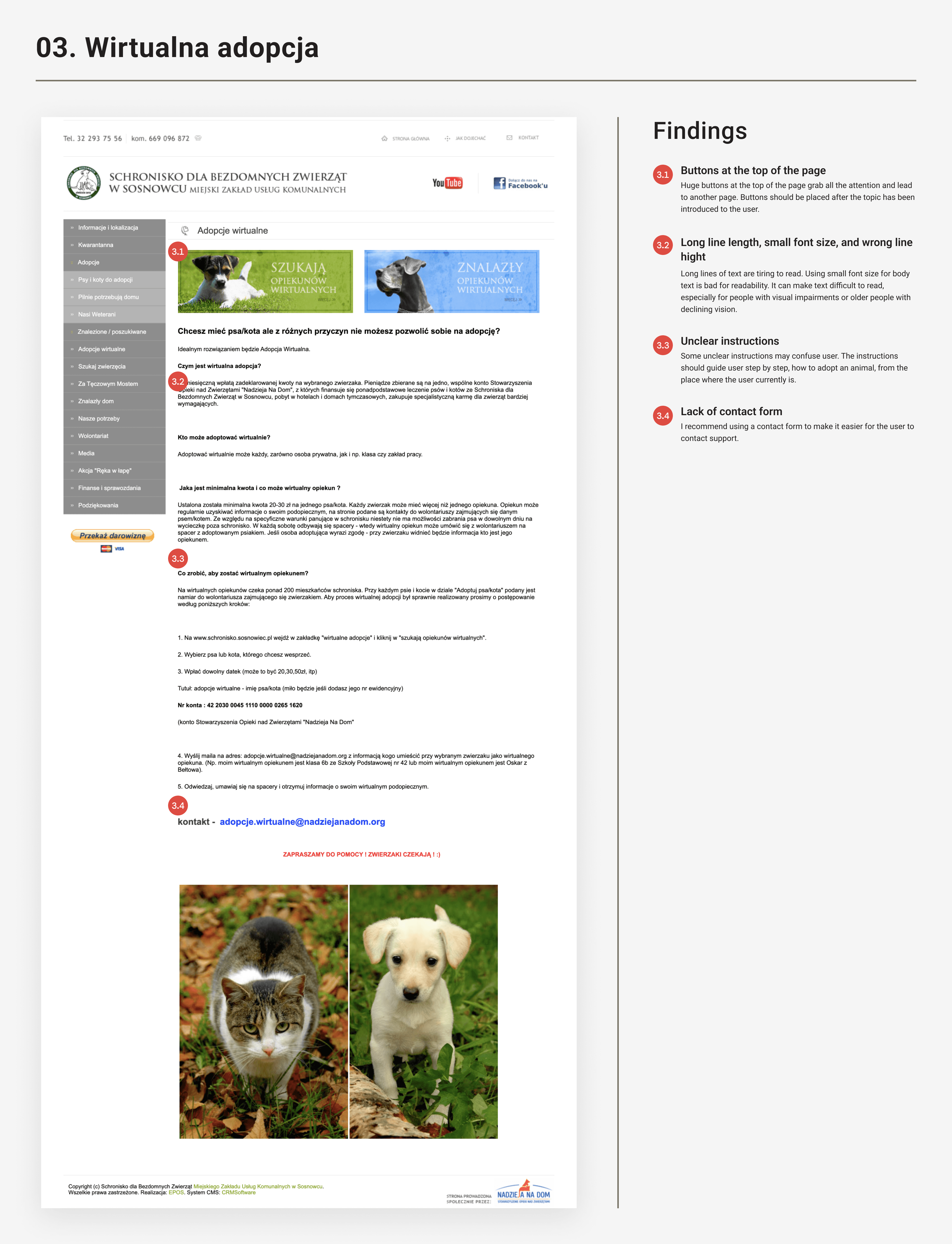
To understand what kind of problems the website currently has I did an website audit. I searched through the website and following ten usability heuristics, as well as Gestalt principles, I tried to understand the biggest errors. Here is what I found.
To understand what kind of problems the website currently has I did an website audit. I searched through the website and following ten usability heuristics, as well as Gestalt principles, I tried to understand the biggest errors. Here is what I found.


Recommendations
Recommendations
To summarise what I found, I made a table of recommendations, prioritising the errors. I also wrote down my suggestions for each problem.
To summarise what I found, I made a table of recommendations, prioritising the errors. I also wrote down my suggestions for each problem.

Implementations
Implementations
Next, I developed my suggestions and implemented them in my designs. I have listed my decisions below.
Next, I developed my suggestions and implemented them in my designs. I have listed my decisions below.

General implementations
👉 I rethought and restructured the navigation. I assumed, that every menu element on the existing site is important and I kept all of them. I asked a few friends for their opinion and by using card sorting method I established a new navigation structure. Thanks to that, I was able to reduce the number of menu elements to five main categories
👉 I have created a footer putting all the necessary information there. Address, phone numbers, emails, social media links and informations about sponsors. In previous version of the page the driving directions were exposed in navigation, so I decided to place them in footer, where most people would be looking for this information
👉 When creating the navigation system, I made sure that every element pass the WCAG test for at least AA level
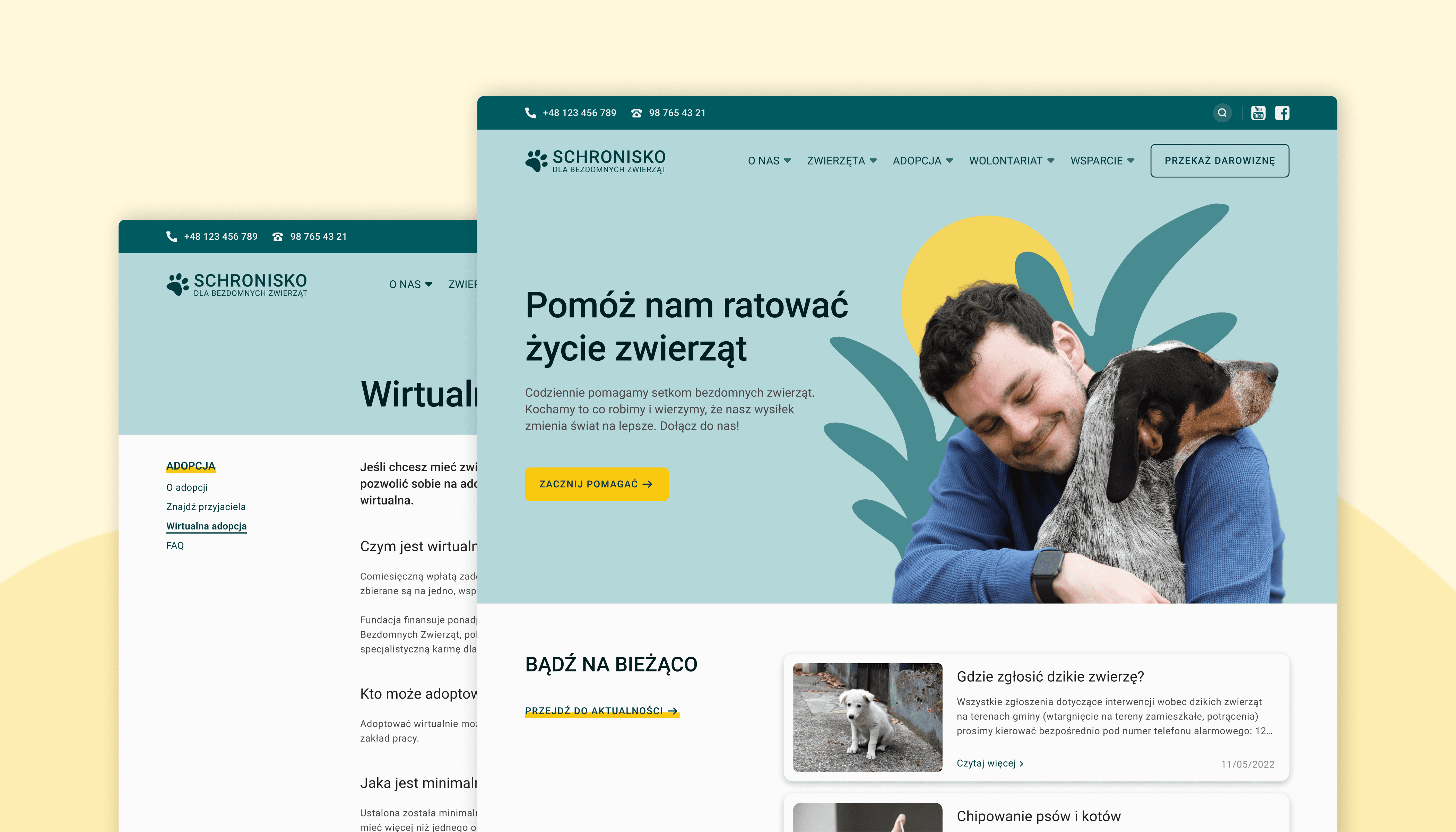
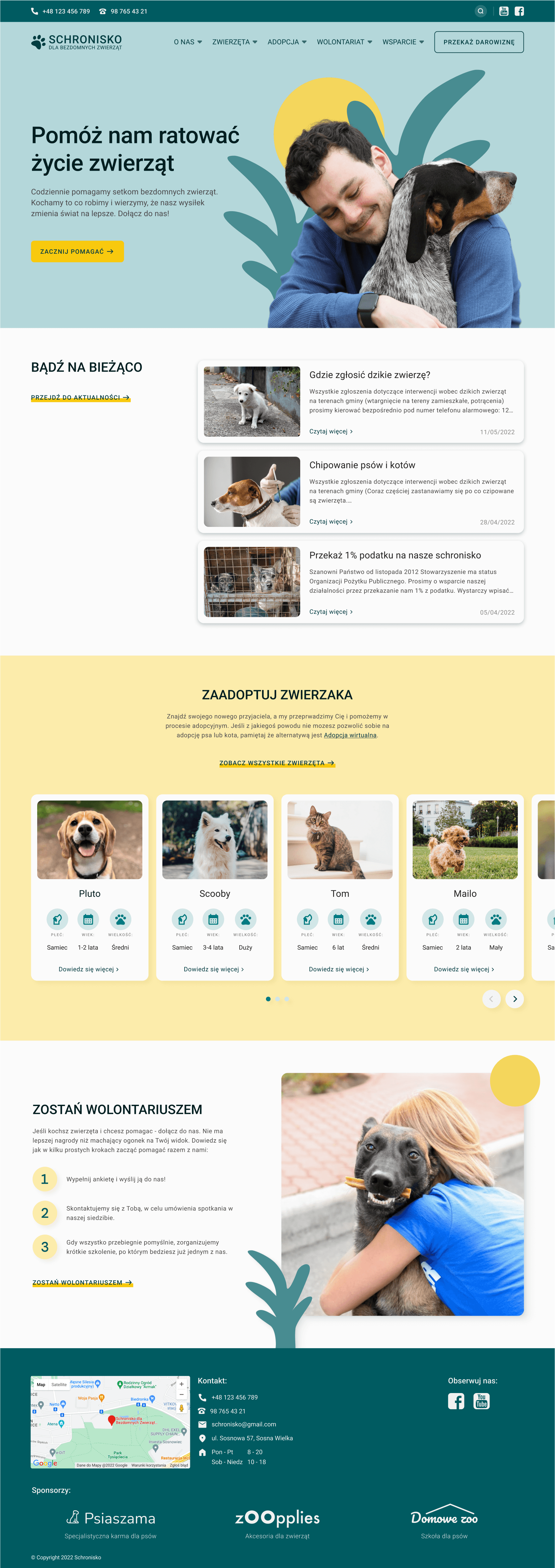
Homepage
Homepage
👉 I rearranged the structure of the information, created a hierarchy and decided which sections I wanted to show on the home page
👉 I have created each section by selecting both visual and verbal content and separate them in a clear way
👉 I decided to keep the news section (Aktualności), to which current users may have been accustomed, I also showed the section adoption, mentioning the possibility of virtual adoption, and a section that explains how to become a volunteer
👉 I changed the layout of the site, gave rules for the use of font sizes for different types of information, and changed the colour palette of the site, now based on shades of yellow and green, associated with happiness and serenity
👉 I created a hero section briefly describing what the organisation does. I used a photo of a man with a dog, which shows the organisation's bond with animals and evokes empathy in users
👉 I created primary CTA button and secondary button which stick to the top bar
👉 I designed the mobile version of the website

Wirtualna adopcja - subpage
Wirtualna adopcja - subpage
👉 I redesigned the way long text is displayed on the page. I set the body text size to 16px, and the line height to 150% so that users can find the information faster and improve readability
👉 I have included a vertical menu on the left side for easier navigation. Thanks to that, the user knows where currently is and can easily switch between pages. In addition, the use of a vertical menu, allows sub-pages to be added, and leaves space for adverts to be placed below
👉 I have rethought the content on the site and redesigned it to make it easier for the user to find informations
👉 I have visually highlighted the instructions on how to virtually adopt an animal, which is the main purpose of the site
👉 I added a contact form to make it easier for users to contact support
👉 I designed the mobile version of the website

Summary
Summary
This project is an example of putting theory into practice. After weeks of studying heuristics and Gestalt principles, I was finally able to use this knowledge to spot and define problems. Only when I understood them I was able to implement the right solutions to improve the website's usability.
Thanks for reading this and see you in my next project!
More projects


hypothesis
desk research
competition analysis
wireframes
user interviews
impact/effort matrix
user flow
usability testing
prototype

competition analysis
moodboard
visual design
microinteractions
prototype
Let’s talk
Let’s talk
2024 Portfolio by Jędrzej Urbaniak